
As the U.S. Unemployment Rate drops below 5% for the first time since the 2008 recession, Obama continues to pat himself on the back on what a great job he has done since the subprime mortgage crisis. When looking at the chart below, it’s tough to argue with him. On the surface, the Unemployment Rate has been cut by more than half since 2010. Surely, our economy has to be “stronger” than ever right?
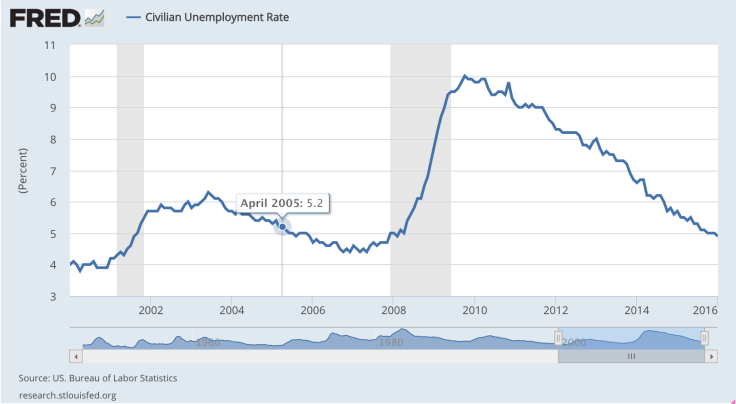
In theory, accurately reported Unemployment Rates are and should be strong economic indicators. The more people that are employed, the better the economy and vice versa. What most followers of mainstream media fail to realize is that the Unemployment Rate (when used alone) is very misleading because it fails to properly reflect (1) the population of Discouraged Workers and (2) the quality of jobs of Employed Workers.
For those of you who didn’t pay attention in your high school economics class:
- Labor Force = Employed Workers + Unemployed Workers
- U.S. Unemployment Rate = Unemployed Workers / Labor Force
As defined by the BLS, a worker is classified as Unemployed if they do not have a job, have actively looked for work in the last 4 weeks, and are currently available for work. In a perfect world, Unemployed Workers would actively seek out new jobs until they are successful. However, this is not always the case because those that are unsuccessful over a prolonged period of time will eventually stop looking, making them Discouraged Workers. And since Discouraged Workers are excluded from the Labor Force calculation, this would naturally understate the U.S. Unemployment Rate.
In order to derive a more accurate representation of the U.S. Unemployment Rate, we should also look at the Labor Force Participation Rate, which currently hovers around 62%.
Labor Force Participation Rate (LFPR) = Labor Force / Adult Population (aged 16+)
Below is a graph that charts the Labor Force Participation Rate vs. the Unemployment Rate. Doesn’t it seem odd that post-2010 both metrics are positively correlated? Assuming the Labor Force is held constant, the exact opposite (a negative correlation) should hold true. As the Unemployment Rate decreases (i.e. more people get jobs), the Labor Force Participation Rate should increase.

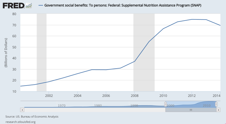
The underlying issue here is that the Labor Force is actually decreasing (not held constant). As more and more Unemployed Workers lose faith in the job market and become discouraged; they are dropping out of the Labor Force and turning to the government for help. Although indirect, this can be seen in the two charts below:

As an aside, don’t be surprised if you see government spending on food stamps and the number of people dependent on it decreasing in the near future. 40+ states are implementing time limits (3 months) that will eventually cut off the nation’s poorest people.
Using a back of the envelope calculation based on government figures and assumptions, I believe that, at the very minimum, the true U.S. Unemployment Rate is 20% (my analysis is at the end of this post). Obviously this is a very rough floor using rather broad assumptions, but if we ever get close to Donald Trump’s 40% Unemployment Rate, we might as well be called the United States of Welfare. While I think we may actually be closer to 30% because Trump fails to exclude retirees that can actually afford to stay retired (or are too old to work), 40% is a real possibility if structural changes aren’t made in our society.
To compound the problem of rising unemployment, the quality of jobs available are also failing to keep pace with our population growth. Since our country’s population growth is positive (i.e birth rate > death rate), if jobs aren’t created at least on pace with population growth, more people will be left unemployed. This is exactly why more and more young adults have no choice but to work minimum wage jobs, continue to default on their student loans and are forced to live with their parents for longer.


In short, despite all the positive buzz our media has generated over the last 7 years, our economy is no better off than it was in 2008. If you look at the chart below, the average household is actually worse off. While various asset classes have undoubtedly ballooned thanks to the malinvestments caused by Quantitative Easing and artificially low interest rates, it’s just a matter of time before shit hits the fan. At some point, our central bankers need to stop kicking the can and face the music; otherwise, eventually the public will wake up and shit will, as Marshawn Lynch would say, “GET REAL IN THE FIEELD.”

P.S. – If anyone has any feedback on my analysis, let me know. Happy to discuss and always eager to learn more about other people’s opinions and point of views!
Back of the envelope Unemployment Rate Analysis:
- Adult Population 16+ = 100 (to keep things simple)
- Labor Force = 62 (derived from Labor Force Participation Rate)
- U.S. Unemployment Rate is ~5% (given)
- Employed Workers: 59 ( 59/62=~5% )
- Unemployed Workers: 3 ( 62 – 59 )
- Retired Workers = 19
- Population aged 65+ (48M) / Population aged 16+ (256M)
- Discouraged Workers = 19
- Adult Population – Labor Force – Retired Workers
- Unemployment Rate = 22
- Unemployed Workers + Discouraged Workers

February 19, 2016 at 6:46 pm
WE WANT MORE URUGUAY
-scrubs of the bullpen
LikeLike
March 5, 2016 at 10:40 pm
Very insightful, Curt. Real talk!
LikeLike